FIT FLEET: Service Station Booking Service.
Booking a car for service was taking too long. I redesigned the flow so it didn't.
The problem
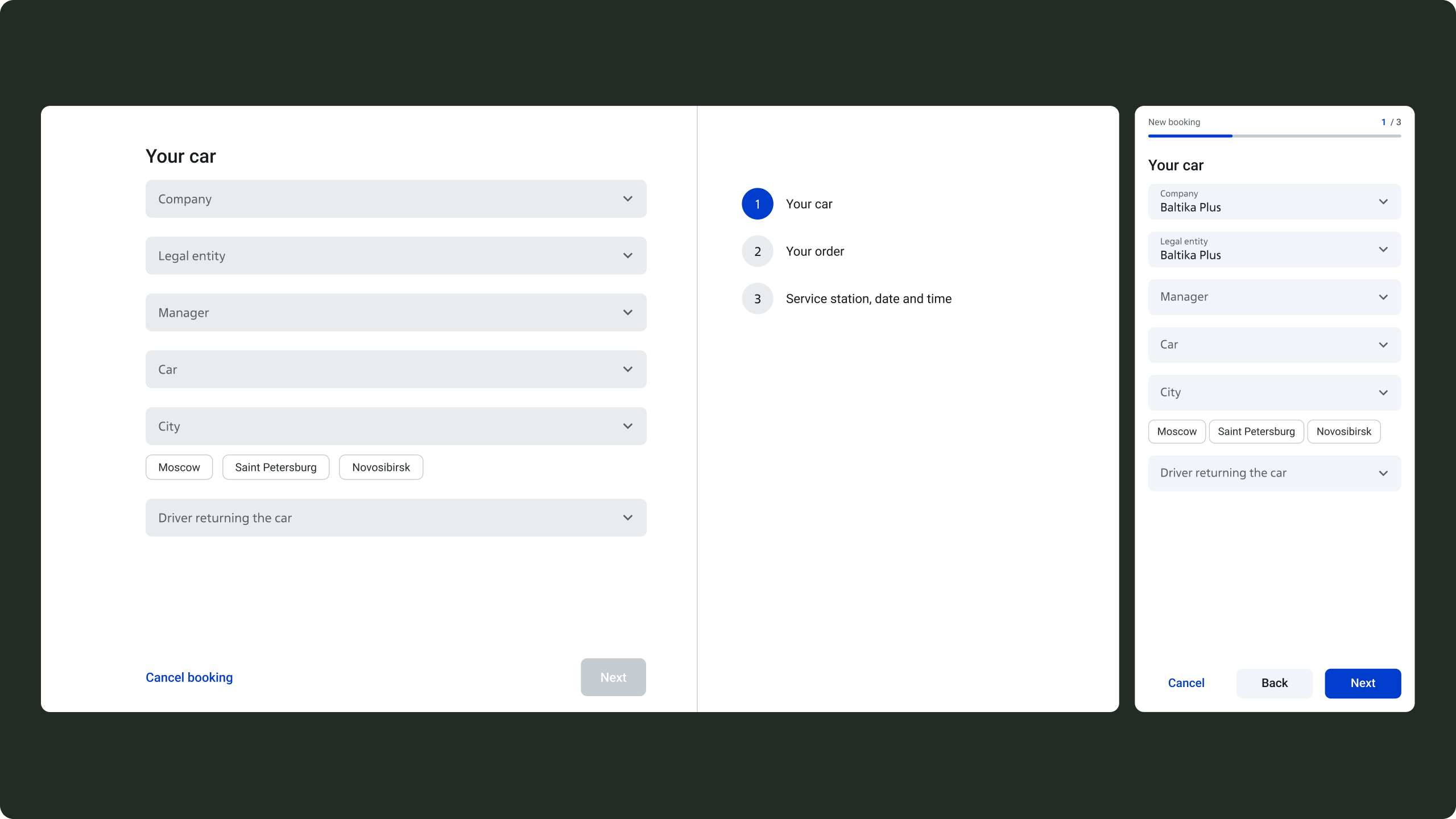
Car park owners use this flow every day. The old one made them work for it — too many fields at once, no sense of progress, easy to lose your place halfway through.
Approach
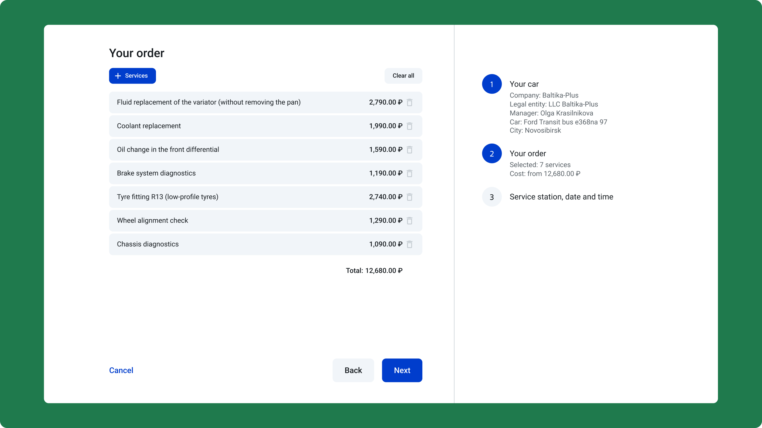
We walked through the existing flow and mapped every friction point in Miro. Then I restructured it around one rule: show only what the user needs right now. We tested it as an interactive Figma prototype before any dev work started.
The flow
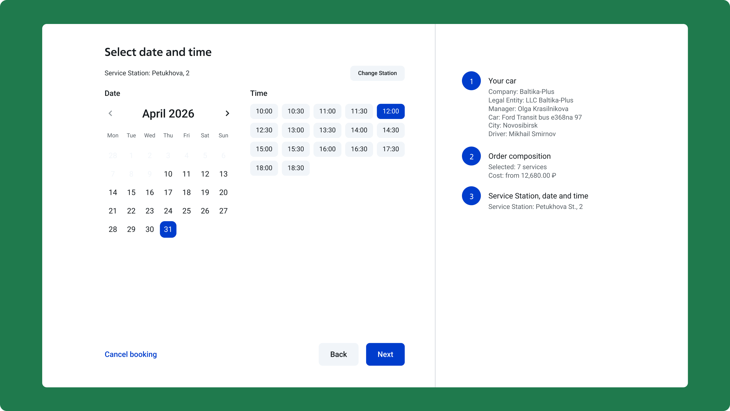
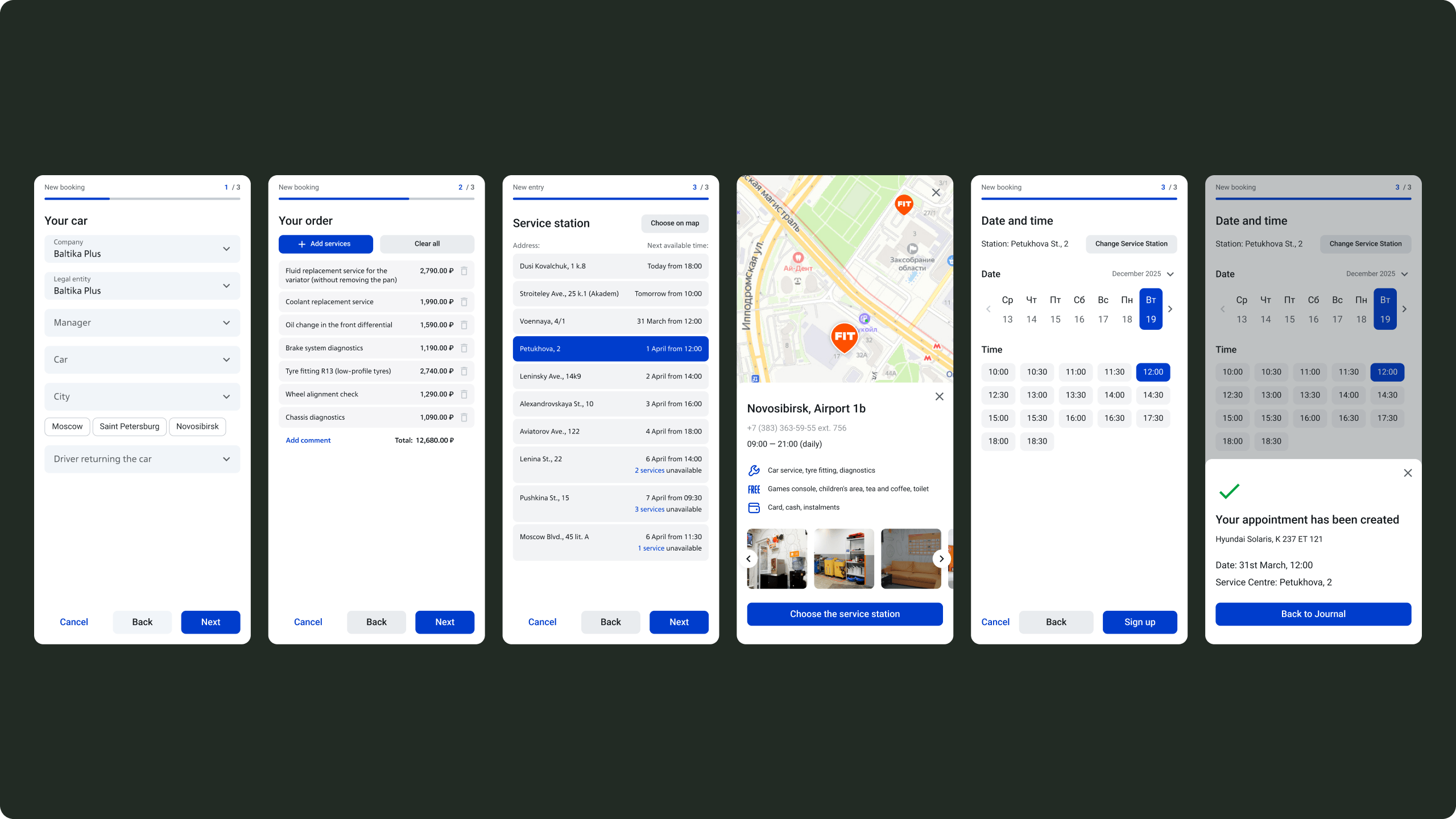
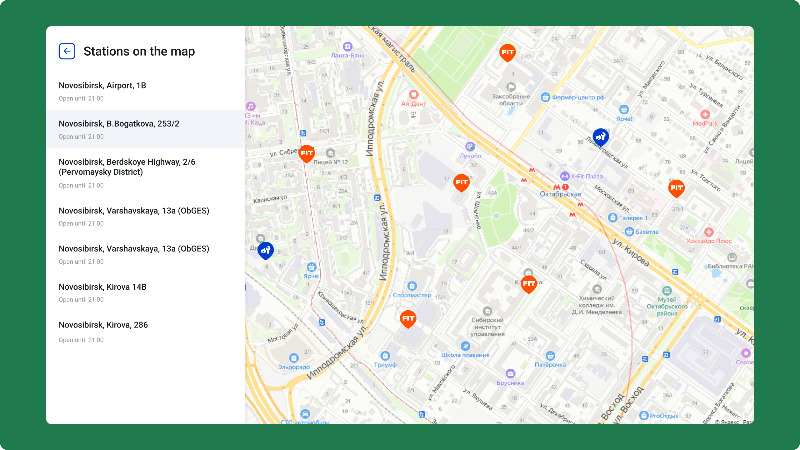
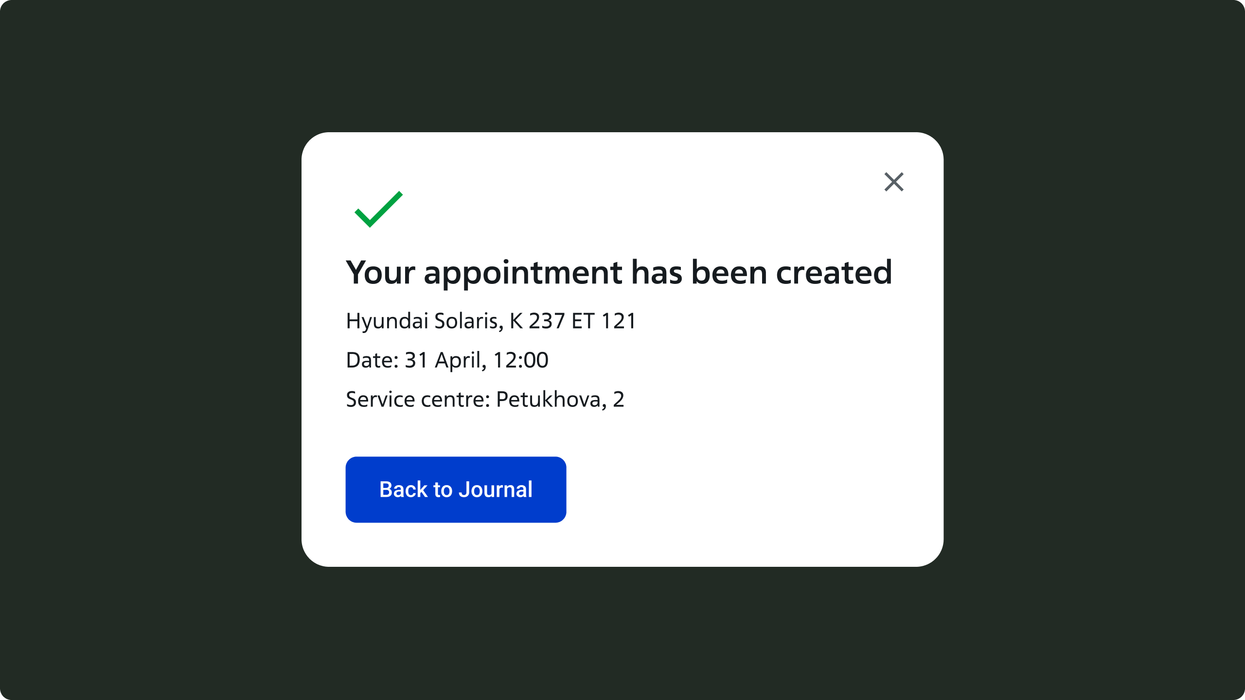
Three steps: pick a car, choose services, select a station and time. A summary panel stays visible on the right the whole way through — so you always know what you've chosen and can go back without losing anything.
Design decisions
Splitting the flow into stages was the main call. Once each step had one job, the visual design mostly sorted itself — clear labels, consistent inputs, nothing extra.
Outcome
Clients reacted well in testing — said it felt faster and easier to trust. That feedback came from prototypes, before any code. Good sign.
Four weeks from brief to tested prototype. In a flow like this, getting the structure right early is most of the work.
Let's talk.
Reach out if you're building something and want a senior pair of eyes on it. I read everything that comes in.